Sunday, 18 May 2014

Egyptian Sculptures

  
"Ka Statues"
Sculptures were a very important feature of the great temples and tombs of ancient Egypt. It was believed that these sculptures filled the place with powerful spiritual qualities.

Some sculptures include descriptions of kings, gods and also symbolic objects starting from the time of the Old Kingdom to the middle of the Roman Period. Egyptian sculpture took the form of statues and reliefs. These were often life-sized. All statues and reliefs were carved into blocks of stone. Some of them were not only carved but also painted with natural minerals such as iron ores (red and yellow colours), copper ores (blue and green colours), soot or charcoal (black) and limestone (white).

Egyptian sculptors were the first people to create life-sized statues and reliefs in stone, copper and wood. They produced detailed images of animals, plants, humans, and even landscapes. Through their sculptures, they recorded the essential elements of their world for eternity. Normally, the kings used reliefs to record victories in battle, royal forces, and religious scenes. Whilst sculptures were usually of kings, gods and goddesses.

Sculptures such as the ‘ka statues’ usually served as funerary art. They accompanied the deceased in burial tombs with the intention of preserving life after death.

The Great Sphinx is the largest sculpture around the world. It is located among the great pyramids of Giza. It is 241 ft long , 63 ft wide, and 66.3 t high. The Great Sphinx is carved out of limestone. As many of you know, it represents a mythical creature known as a sphinx. The sphinx has a lion’s body but a human head. It is believed that the head is that of the King Khafra, who was ruling at that time. I personally believe, that the statue is half lion to symbolize power.

"The Great Sphinx"


References

British Museum, N/A. The British Museum. [online] Available at: <http://www.britishmuseum.org/explore/galleries/ancient_egypt/room_4_egyptian_sculpture.aspx> [Accessed 18 May 2014].

Friday, 16 May 2014

Ancient Egypt Tattoos

Tattoos have been used for thousands and thousands of years. The earliest known examples of tattoos were found present on several female mummies. These are dated to 2000 B.C.

Evidence about these tattoos is found. The evidence that women had tattoos on their bodies is found in figurines and female figures represented in tomb scenes.

The tattoos seem to be only a female practise in ancient Egypt. Mummies found with tattoos were usually dismissed by the male undertakers who seemed to assume that these women were of ‘dubious status’. These mummies were also not buried as they should have. For example one of the women was a high-status priestess named Amunet but was described as “probably a royal concubine”.

It has been long assumed that such tattoos were the mark of prostitutes or were meant to protect women against sexually transmitted diseases. Some also believe that the tattooing of ancient Egyptian women had the function as a permanent form of amulet (to protect them from the evil) during the difficult times of pregnancy and birth. The tattoos are around the abdomen, on top of the thighs and the breasts. The tattoos applied around the abdomen are usually dots. During pregnancy, this pattern would expand in a protective fashion in the same way bead nets were placed over wrapped mummies to protect them and ‘keep everything in’.

It is possible that the instruments they used for tattoos are best described as a sharp point set in a wooden handle and is dated to 3000 B.C. Small bronze instruments that resemble wide, flattened needles were also found. If these are tied together in a bunch, they would create repeated patterns of multiple dots.


References
C. Lineberry, 2007. The Ancient and Mysterious History. [online] Available at: <http://www.smithsonianmag.com/history/tattoos-144038580/?page=2> [Accessed 16 May 2014].

Sarduriur, 2013. For Service, Slavery and Sex: Tattooing in Ancient Egypt and Mesopotamia. [online] Available at: <http://warboar.wordpress.com/2013/10/02/sss/> [Accessed 16 May 2014]. 

Pyramids

One of the 1st pyramids
A pyramid is a structure that roughly, its shape is that of a pyramid in a geometrical sense. From the outer look, a pyramid has triangular surfaces that meet to a single point at the top. Not every pyramid is of the exact same shape. A pyramid must have at least 3 surfaces (without base). Saying that, it may have more than 3 surfaces. The most common pyramid shape is the one with a square base and 4 triangular surfaces.

The pyramids were built by Ancient Egyptians. They have built them as toms for the pharaohs and their queens. There are about 80 pyramids known today that were built in Ancient Egypt times. The three largest and best-preserved of these were built in Giza. The most well-known pyramid was built for the pharaoh Khufu. It is known as the ‘Great Pyramid’. 

'Benben'
Why did Egyptian rulers choose this particular shape and why did they build them so large? Nowadays, it is believed that they chose this shape to mimic the ‘Benben’. The Benben is a pyramid shaped stone found in the earliest of temples. It is thought to symbolize the elevation of earth from which the Egyptians believed that life emerged. This is also connected to Re (the Sun God) as it was him who according to some of the ancient Egypt mythology, rose from the earth to create life. Regarding the size of the pyramids, they symbolize the power of the pharaohs and maybe even the glory and strength of their country.

By time, pyramids evolved. The first one built in Egypt had stepped sides and the top of it was a flat surface (as we best know). As they evolved, there were both failures and glorious failures that finally led to the smooth sided pyramid. Throughout their history, pyramids continued to evolve. Not always from the outer appearances, but from the way they were built and in the construction. They had arrangements of the layout of the internal chambers.


Pyramids


References:
AKN Solutions, 2013. The Great Pyramids and More. [online] Available at: <http://www.touregypt.net/featurestories/pyramids.htm> [Accessed 16 May 2014].

The British Museum, N/A. Pyramids. [online] Available at: <http://www.ancientegypt.co.uk/pyramids/home.html> [Accessed 16 May 2014].

Wednesday, 14 May 2014

The Prince of Eypt

Architecture
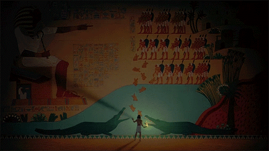
The Prince of Egypt is a motion picture film about Moses. Both artistic and historical license was taken.
In this film, Egyptian architecture is shown. 

The statues shown in the film are clearly inspired by real life, historical Egyptian architecture.

Hieroglyps
Hieroglyphics are also shown in The Prince of Egypt. During Ancient Egypt times, the hieroglyphic script was mainly used for formal inscriptions on the walls of temples and tombs. The word hieroglyph comes from the Greek hieros (sacred) and glypho (inscriptions). In some inscriptions, the glyphs are in full colour whilst others are simply plain outlines.

Looking at the jewellery in this film, one can clearly notice the difference between the rich people and their slaves. The slaves are dressed with plain clothing while the family of the king are all dressed in white clothing and gold jewellery. During Ancient Egypt times, jewellery was very important to their culture. The Egyptians wore their jewellery to honour their gods and pharaoh. At the time, the Egyptians’ beliefs were that if they wore jewellery they were most likely to survive the afterlife. They also believed that jewellery makes them look more attractive to everyone else.


References:
PrinsenAvEgypten , 2013. The Prince of Egypt 1998 English (Multi-Subs). [video online] Available at: <https://www.youtube.com/watch?v=Epk7JUofoEY> [Accessed 14 May 2014].

S. Ager, 2014. Omniglot. [online] Available at: <http://www.omniglot.com/writing/egyptian.htm> [Accessed 14 May 2014].

Egyptian Revival

Furniture
The Egyptian Revival is the same Egyptian style that was brought back around the 19th and 20th centuries. The major art works of Egyptian art such as the pyramids and the sphinx were used in various artistic media including architecture, furniture, ceramics, and silver.

Over the 19th century, other continents started to get influenced from this Egyptian Revival. American tastes started to evolve from a highly ornamented artistic taste to a simpler sense of decoration.
The first wave of Egyptian Revival in the United States was firstly architectural such as the Washington Monument which was begun in 1848. There are also many examples of Egyptian-inspired cemetery architecture.
Architecture

Architecture in cemetery
The first wave of Egyptian Revival in the United States was firstly architectural such as the Washington Monument which was begun in 1848. There are also many examples of Egyptian-inspired cemetery architecture. 


The second wave of the Egyptian Revival style in the United States began around 1870. After the civil war, Americans became interested in other cultures. They mostly looked to the Middle East and North Africa for inspiration.

Most of the Egyptian Revival furniture is marked by a combination of Egyptian symbols with traditional Western forms, particularly the classical.

The sphinx, the pyramid and hieroglyphics (symbols) became common iconographical forms. In fact, they are all seen in Tiffany & Co.’s ornamented clock which was once owned by her father Charles.
Tiffany & Co.'s ornamented Clock


References:
Ickow Sara, 2010. Heilbrunn Timeline of Art History. [online] Available at: <http://www.metmuseum.org/toah/hd/erev/hd_erev.htm> [Accessed 12 May 2014].     

Sunday, 11 May 2014

Egyptian

Worship
Praise

Egyptian artists developed forms that became the usual way of expressing meanings.For example this is how worshipping is always shown in Egyptian art. With both arms extended forward and both hands upraised, whilst praising is always shown with a figure bent on one knee, with one arm raised and the other held against the chest with a clenched fist.

Egyptian artists were not interested in shadows, or space. Therefore their art is simplified. Their art is based on clear outlines, simplified shapes, and flat areas of colour. In a way, Egyptian art resembles the Japanese prints. There is also no sense of perspective. Scenes were always arranged in horizonatal rows which are called registers.   Images of the king are often larger than the others. This is to give the ruler more importance.   

Blue and green were usually associated with water and vegetation. Yellow and gold stood for the sun and the sun god. Red and red-orange involved the desert, power, blood and vitality. Gender was also indicated by the colour. Men were drawn with a reddish-brown skin while women were drawn with a yellow-tan colour.


References:
Edith W. Watts, 2014. The Metropolitan Museum of Arts. [online] Available at: <http://www.metmuseum.org/~/media/Files/Learn/For%20Educators/Publications%20for%20Educators/The%20Art%20of%20Ancient%20Egypt.pdf> [Accessed 10 May, 2014].  


Saturday, 12 April 2014

Contemporary Artist

Raymond Pitre - Artist
Raymond Pitre is one of the best known Maltese contemporary artists. He was born in 1940 during an air raid. His one and only wish was always the one to paint.
R. Pitre, 1979. 'Screaming Man' [oil].

In general, I think that Pitre’s work is very colourful. Sometimes, his paintings show sadness, frustration, and insecurity but these paintings are also colourful. Most of his work consists of thick brush strokes and also a few splashes in some paintings. I must say that Pitre’s work is very expressive. His childhood was not a very good one. He was born a rebel. School was a great obstacle for him and he often skipped it. Raymond Pitre’s family environment was always tense and never really tranquil. He says that the relationships between his parents were always strained and difficult, often stormy, so that he always felt insecure. I think that therefore, his paintings really express his feelings.

E. Munch, 1893. 'The Scream' [oil and pastel]. National Gallery, Oslow,Norway. 
Because the artist was no one’s student and because he had not attended the school of art or mixed with other artists, Pitre was unknown at the time outside his small circle of friends. However, in 1959 Enrico Scicluna encouraged him to enter a work for a Sacred Art Exhibition which was to be held in the following year. Pitre was unemployed at the time but he invested in a large canvas and a new set of paints and worked on ‘Mystic Return of St Paul’. He was influenced by Salvador Dali’s ‘The Madonna of Port Lligat’. His painting was highly rejected and turned down along with Pitre’s feelings. He was very disappointed. At this time, Pitre started to discover some interest in religion and wanted to become a monk. However, this did not work out and the artist went back to the usual world, unemployed and also with a depression. In the 1960’s he was suffering from agoraphobia which is a fear of being in public places and resulted him in always staying in his studio. It was at this time when he started to work on the series ‘the Scream’. The topic is not a new one. It is quite obvious that the inspiration came from Edvard Munch’s famous painting called ‘The Scream’.

R. Pitre, 1962. 'Scream' [mixed medium].
Pitre did not want to paint the act of a screaming man in a sudden attack of panic, like Munch did. He wanted to paint the scream itself as an expression of his own state of being at that time. As for Munch’s painting the background was important. However, it was unimportant for Pitre’s scream. In fact, for him a busy background was a distraction so he reduced it to a monochrome background. The screaming face in Raymond Pitre’s work is the whole length of the painting. An elongated face which is certainly human but very strange.  As Munch’s painting, the eyes in Pitre’s work are also filled with fear; also the mouth is opened in the act of screaming.

You can see drama in this series of the scream. However, what is different from Edvard Munch’s work is that here, the drama lies in the fact that the scream does not escape into nature such as Munch’s. It remains soundless. It can only be heard in the head and reflected in the features.
R. Pitre, 1964. 'Scream 1' [oil].


References:

F. Salt, 2011. Frank Salt – Fine Art. [online] Available at: <http://www.franksaltfineart.com/Paintings/291/11158> [Accessed 11 April 2014].

K. Wain, 2000. Pitre. Malta, Pitre. 

Thursday, 10 April 2014

Xebgha nies - Different People | Visit

This is an exhibition which I have attended at the St. James Cavalier in Valletta. The exhibition consists of works by many different artists as shown in the title of the exhibition itself. Each artist had about six artworks shown.


M.Scicluna, 2014. 'L-Immigrant Abjad' [Indian Ink]. St. James Cavalier, Valletta.
This is one of Mark Scicluna's work. It is done by Indian Ink on aged paper. As you can see, this painting has a lot of space. However, it is quite balanced. I think that the fact that the figure is not placed straight, but diagonal is very interesting in the terms of space. 
As you have probably noticed, the figure drawn is not balanced, but this is for intentional purposes. This way, the figure looks more cartoonish.

M.Scicluna, 2014. 'Harry Houdini (tal-Plastik)' [Indian Ink]. St. James Cavalier, Valletta.

This is another work by Mark Scicluna and it is also made by Indian ink on aged paper. Here, Scicluna have drawn another figure. Colour is only in the text. The figure is only shown by an outline and a few other lines to show some detail and there are no shadings in this work.

A.Diacono, 2014. 'Mother and Child' [mixed media relief]. St. James Cavalier, Valletta.
This work is by Andrew Diacono and it is a high relief. It shows a mother holding a baby in her hands. The figures are unrealistic. Both the mother and the baby are too long. All of Diacono's work which was shown in this exhibition are with this kind of style. All figures are unrealistic. They are all too long. His paintings are also minimalists. 
A. Diacono, 2014. 'Guitarist' [oil]. St. James Cavalier, Valletta.


These are six oil paintings by Saviour Baldacchino. They are all with a religious subject but none of them has perfect figures or anything.
S. Baldacchino, 2014. 'Pride of George' [mixed media]. St.James Cavalier, Valletta.

M. Attard, 2014. 'Bar Code' [mixed media]. St. James Cavalie, Valletta.

'Bar Code is a work by Marisa Attard. It is mixed media. This artwork consists of four people at a bar. The bar resembles a bar code therefore, I think that the name fits the painting perfectly. The figures are non realistic.

Monday, 31 March 2014

The Scream

E.Munch, 1893. The Scream [oil and pastel]. National Gallery, Oslow, Norway.

Normally, Munch’s art represented his own emotions especially the darker ones of fear, dread, loneliness, and sexual longing. His most famous artwork is The Scream. The Scream is a lithograph that was painted by Edvard Munch in 1893.

The screaming figure in this painting shows existing horror. A previous drawing of the same concept, is a drawing of a man (which is Munch himself) on a similar bridge and with a blood-red sky above. A text was found accompanying that drawing which said:  “I walked with two friends. Then the sun sank. Suddenly the sky turns as red as blood … My friends walked on, and I was left alone, trembling with fear. I felt as if all nature were filled with one mighty unending shriek.”


It is known that in The Scream, Munch has drawn a spiritual experience. The figure is unrealistic. It swirls as if to continue with the pattern of the landscape. Munch did not paint his own appearance but the way he was feeling. The Scream is expressionistic because Munch expressed his feelings through this painting. 

References:
ArtHistoryLuv, 2013. Private Life of a Masterpiece [video online] Available at: <https://www.youtube.com/watch?v=OLnR5ki8JgM> [Accessed 30 March 2014].
Heilbrunn Timeline of Art History, 2006. The Metropolitan Museum of Art. [online] Available at: <http://www.metmuseum.org/toah/works-of-art/1984.1203.1> [Accessed 30 March 2014].   

Saturday, 29 March 2014

Art Nouveau

Art Nouveau (New Art) started in Belgium and was inspired by the Arts and Crafts Movement which is very much inspired by nature. Therefore, flowers, leaves and natural, organic shapes are also seen in Art Nouveau paintings. The main characteristics of Art Nouveau are the whiplash curves, absence of straight lines and 90° angles and elements of living organisms such as animals, insects and birds. The most common organisms were the swans, dragonflies, peacocks and swallows. All these had a symbolic meaning to the artists.


Alphonse Mucha was an Art Nouveau painter. He was Czech but lived in Paris. The ‘Laurel Lady’ and ‘Ivy Lady’ are two of his paintings which are a great example of art nouveau. As you can see in both the paintings, there are a lot of natural elements and curves shown. 
A.Mucha. 'Laurel Lady' and 'Ivy Lady' [oil]

The pattern with an artichoke is a painting by John Henry Dearle from the Arts and Crafts Movement. The other one is from Art Nouveau. As you can see, organic shapes are very common in both styles. The difference between Art Nouveau and the Arts and Crafts movement is that Art Nouveau usually includes a female figure.

References:
G, Cybele, 2006. The Metropolitan Museum of Art. [online] Available at: <http://www.metmuseum.org/toah/hd/artn/hd_artn.htm> [Accessed 29 March 2014]. 

Saturday, 22 March 2014

Vincent Van Gogh

Vincent Van Gogh is a self-taught Dutch artist. ­­He gained his painting skill mostly by copying prints and studying 19th century drawings manuals and lesson books such as; ‘Charles Bargue’s Exercises au fusain and cours de dessin’.
At first he felt that it was more necessary to master black and white before colour. He first concentrated on learning figure drawings and rendering landscapes in the correct perspective. In 1882, Van Gogh executed his first independent works in water colour and moved to oil painting.
Van Gogh was staying in Paris from February 1886 – February 1888. There, he saw the work of the Impressionists and also witnessed works by the Neo-Impressionists George Seurat and Paul Signac. He was very much influenced by their work. Therefore, Van Gogh lightened his palette, and experimented with broken brush strokes of the Impressionists and also the pointillist touch of the Neo-Impressionists.   

I think that this is a great example of how Van Gogh was influenced by the Impressionists. In the ‘Ploughed Field’ you can see that the artist used a lighter palette than his earlier work. In his painting you can also see rough brush strokes which are also seen in Claude Monet’s work ‘Impression Sunrise’.
Van Gogh, 1888. Ploughed Field [oil]  
Claude Monet, 1872. Impression Sunrise [oil], Musee Marmottan Monet, Paris
As I said earlier, Vincent Van Gogh gained his skill by copying prints.
The one on the left is a Japanese print by Utagawa Hiroshige Ohashi Bridge, Sudden Shower at Atake. The one on the right is Van Gogh’s interpretation. One can clearly see that the Japanese prints’ influences are also in Van Gogh’s work such as; the bold blocks of colours, and diagonal lines.


References:
Department of European Paintings, 2010. The Metropolitan Museum of Art. [online] Available at: <http://www.metmuseum.org/toah/hd/gogh/hd_gogh.htm> [Accessed 22 March 2014].  
John Fitzsmmons, 2014. The Painter’s Keys. [online] Available at: <http://clicks.robertgenn.com/japanese-prints.php> [Accessed 22 March 2014].

Saturday, 15 March 2014

Pugin (1812-52)

Augustus Welby Northmore Pugin was a writer, architect, designer and theorist. His writings provided the foundation of the development of the Arts and Crafts. For him, the Gothic represented the order and stability of Christian faith. Therefore, he rejected the early Victorian popular currency for Classical Architecture in favour of a revival of Medieval Gothic.
Pugin, who favoured the revival of the 14th century Gothic, attempted to create an entire consistent architecture and interior environments in his style. He wanted the reunite the spiritual life and the everyday life. He believed that the Gothic style will help make this happen.

“Pugin’s message was simple: If there is something wrong with our cities, then there is something wrong with ourselves, and society and architecture both need reform.”

By designing a range of interior fittings, he wanted to express entire schemes of design in Gothic terms rather than put Gothic architectural details as means of decoration.
The House of Parliament

This is the House of Parliament which is of the style Neo-Gothic. Neo-Gothic is the new revival of the Gothic style which was renewed by Augustus Welby Northmore Pugin.


This is then, an example of Gothic architecture. As you can see, Gothic and Neo-Gothic architecture are very similar. They both have pointy roofs. However, there are some differences. Neo-Gothic architecture has more of a modern look but you can still see that it is a renewal of the Gothic architecture. 


References:
Rosemary Hill, 2012. The Guardian. [online] Available at: <http://www.theguardian.com/books/2012/feb/24/pugin-gothic-architect> [Accessed 13 March 2014].  

Monday, 3 March 2014

Retrospect | Visit

Retrospect is an exhibition I visisted of the artist Anthony Lucian Cauchi. This is an exhibition that took place at the Auberge D'Italie which is in Merchant Street, Valletta. The exhibition consisted of works which have been done between the year 1964 and 2014.

Anthony Lucian Cauchi, 2010. Nymph [Ceramics]


A Nymph is a mythological god knows as a beautiful lady inhabiting the sea, rivers, woods, trees, mountains, etc. Therefore I cannot not say how the artist put the nymph near the trees. When you look at this artwork, the first thing you see is the trees and after a few moments staring at it you will notice the nymph. I think that this fact really shows the mythological beliefs of the nymphs.
I think that the glazes used in this artwork really show how beautiful nature is. The gold really compliments the greens and browns and I think that emphases the beautiful spirit of nature and the nymphs.


Anthony Lucian Cauchi, 2013. Tree of Bodies [Ceramics]


Tree of Bodies is another artwork which was done using ceramics. In it, one can notice a tree with people coming out of each branch. One can also notice bodies in the roots of the tree.
Even though this has been done three years after 'Nymph' you can clearly see that it is of the same series. The colours used are just the same. Only, different textures and brushstrokes. However, despite the weird bodies in the tree, I think that the artist still managed to show the beauty of nature throughout this piece of art.


Anthony Lucian Cauchi, 2013. Thorn Birds [Ceramics]
Although this has a circular shape, I think that you have already noticed that it is from the same series as the two above. The colours used are what defines them.
I love the fact that the first thing you notice are the flowers and foliage and after a few seconds, you will notice the birds and understand the title of the artwork.
I also think that the composition of this ceramic plate is beautiful and it is what makes it interesting.


Anthony Lucian Cauchi, 2008. Madonna and Child [Ceramics]


This is another artwork named 'Madonna and Child' which is done also by Anthony Lucian Cauchi. It shows the beliefs of the Catholics where the son of God was born human.
The child is shown full body but as you can see for the mother, only her head and one hand is shown. The fact that only one hand is shown and also its position shows a sense of embrace.


Anthony Lucian Cauchi, 2014. Digest of Mankind. [Ceramics]

Front View


This is a ceramic piece named 'Digest of Mankind'. It is based on an observation by the artist himself. His observation is that there are a number of organizations which are always ready to "digest" and spite out people.
Knowing the observation of the artist, I must say that this ceramic piece shows feelings. The piece shows people who look like they are holding something huge and heavy. Their positions show struggle.

Anthony Lucian Cauchi, 2007. Heaven and Hell [Acrylics]


As shown in the title of this painting, this shows heaven and hell in the artist's point of view.
Heaven is in the upper half of the canvas whilst hell is in the lower half. Using black background and light blue in the middle and upper half of the canvas, the artist added height to the canvas. Where there is heaven you can see flowers and many colours which are associated with beautiful things. Whilst where there is hell, the canvas seems more monochromatic.


Anthony Lucian Cauchi, 2010. Red Flower Tree [Acrylics]


This painting is done with acrylics and it shows a big tree of red flowers. Clearly, the artist paid great attention to detail. The tree is almost as big as the whole frame. The tree is also placed in a higher area of land than other areas. This gives the tree some importance and more attention.

Wednesday, 26 February 2014

Andy Warhol

Andy Warhol is a very well-known artist for pop art which became very popular in the late 20th century. Though he is mostly remembered for his paintings, he had also created other works such as commercial advertisements and films.

Around the 1960, Andy Warhol had decided to make a name for him in pop art. Back then, pop art was a new style of art. It began in the mid-1950s in England. Pop art consists of realistic interpretations of popular everyday items.

Warhol was used to a blotted-line technique which is a technique where one has to tape two pieces of blank paper together and then draws in ink on one page. Then both the pages would be pressed together. The result would be a picture with irregular lines in which Andy Warhol would colour in with watercolours. Therefore when he tried pop art, it was a bit difficult for him to use paint and canvas and had some trouble deciding what to paint.

The artist began with Coke bottles and comic strips. However, his work was not getting the attention he wished for. In December 1961, a friend of his suggested for him to paint what he liked most in the world, perhaps something like money and a can of soup. He gave her $50 for the advice.
In 1962 Warhol’s first exhibition was up at the Ferus Gallery in Los Angeles. His canvases of Campbell’s soup were displayed, one canvas for each of the 32 types of Campbell’s soup. Lastly, he sold all the paintings as a set for a $1000.

By experience, Warhol noticed that he couldn’t make his paintings fast enough on canvas. In 1962, the artist discovered the process of silk screening. Silk screening is a technique which uses a specially prepared section of silk as a stencil, allowing one silk screen to create similar patterns for a lot of times. He immediately began making paintings of celebrities. His most common one is the large collection of Marilyn Monroe. Warhol would have used this style for the rest of his life.


References:
About, 2014. 20th Century History. [online] Available at: <http://history1900s.about.com/od/artists/p/warhol.htm> [Accessed 26, February 2014]